بروزرسانی: 19 آذر 1404
How To Build Custom Data Visualizations Using Luzmo Flex — Smashing Magazine
In this article, I’ll introduce you to Luzmo Flex, a new feature from the Luzmo team who have been working hard making developer tooling to flatten the on-ramp for analytics reporting and data visualization.
With Luzmo Flex, you can hook up a dataset and create beautifully crafted, fully customizable interactive charts that meet your reporting needs. They easily integrate and interact with other components of your web app, allowing you to move away from a traditional “dashboard” interface and build more bespoke data products.
While many charting libraries offer similar features, I often found it challenging to get the data into the right shape that the library needed. In this article, I’ll show you how you can build beautiful data visualizations using the Google Analytics API, and you won’t have to spend any time “massaging” the data!
What Is Luzmo Flex?
Well, it’s two things, really. First of all, Luzmo is a low-code platform for embedded analytics. You can create datasets from just about anything, connect them to APIs like Google Analytics or your PostgreSQL database, or even upload static data in a .csv file and start creating data visualizations with drag and drop.
Secondly, Luzmo Flex is their new React component that can be configured to create custom data visualizations. Everything from the way you query your data to the way you display it can be achieved through code using the LuzmoVizItemComponent.
That means, besides creating ready-to-use datasets, you can set up functions like the following out-of-the-box:
- Multi-tenant analytics: Showing different data or visualizations to different users of your app.
- Localization: Displaying charts in multiple languages, currencies, and timezones without much custom development.
- Interactivity: Set up event listeners to create complex interactivity between Luzmo’s viz items and any non-Luzmo components in your app.
What Can You Build With Luzmo Flex?
By combining these off-the-shelf functions with flexibility through code, Luzmo Flex makes a great solution for building bespoke data products that go beyond the limits of a traditional dashboard interface. Below are a few examples of what that could look like.
Report Builder
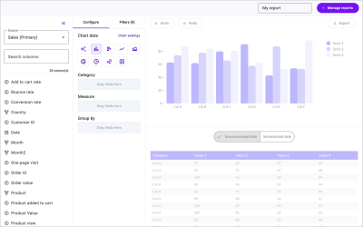
A custom report builder that lets users search and filter a dataset and render it out using a number of different charts.
Filter Panel
Enable powerful filtering using HTML Select inputs, which will update each chart shown on the page.
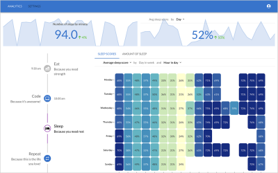
Wearables Dashboard
Or how about a sleep tracker hooked up to your phone to track all those important snoozes?
When to Consider Luzmo Flex vs Chart Libraries
When building data-intensive applications, using something like Recharts, a well-known React charting library, you’ll likely need to reformat the data to fit the required shape. For instance, if I request the top 3 page views from the last seven days for my site, paulie.dev, I would have to use the Google Analytics API using the following query.
import dotenv from \'dotenv\';import { BetaAnalyticsDataClient } from \'@google-analytics/data\';dotenv.config();const credentials = JSON.parse( Buffer.from(process.env.GOOGLE_APPLICATION_CREDENTIALS_BASE64, \'base64\').toString(\'utf-8\'));const analyticsDataClient = new BetaAnalyticsDataClient({ credentials,});const ({ rows }) = await analyticsDataClient.runReport({ property: `properties/${process.env.GA4_PROPERTY_ID}`, dateRanges: ( { startDate: \'7daysAgo\', endDate: \'today\', }, ), dimensions: ( { name: \'fullPageUrl\', }, { name: \'pageTitle\', }, ), metrics: ( { name: \'totalUsers\', }, ), limit: 3, metricAggregations: (\'MAXIMUM\'),});The response would look something like this:
( { "dimensionValues": ( { "value": "www.paulie.dev/", "oneValue": "value" }, { "value": "Paul Scanlon | Home", "oneValue": "value" } ), "metricValues": ( { "value": "61", "oneValue": "value" } ) }, { "dimensionValues": ( { "value": "www.paulie.dev/posts/2023/11/a-set-of-sign-in-with-google-buttons-made-with-tailwind/", "oneValue": "value" }, { "value": "Paul Scanlon | A set of: \\"Sign In With Google\\" Buttons Made With Tailwind", "oneValue": "value" } ), "metricValues": ( { "value": "41", "oneValue": "value" } ) }, { "dimensionValues": ( { "value": "www.paulie.dev/posts/2023/10/what-is-a-proxy-redirect/", "oneValue": "value" }, { "value": "Paul Scanlon | What Is a Proxy Redirect?", "oneValue": "value" } ), "metricValues": ( { "value": "23", "oneValue": "value" } ) })To make that data work with Recharts, I’d need to reformat it so it conforms to the following data shape.
( { "name": "Paul Scanlon | Home", "value": 61 }, { "name": "Paul Scanlon | A set of: \\"Sign In With Google\\" Buttons Made With Tailwind", "value": 41 }, { "name": "Paul Scanlon | What Is a Proxy Redirect?", "value": 23 })To accomplish this, I’d need to use an Array.prototype.map() to iterate over each item, destructure the relevant data and return a key-value pair for the name and value for each.
const data = response.rows.map((row) => { const { dimensionValues, metricValues } = row; const pageTitle = dimensionValues(1).value; const totalUsers = parseInt(metricValues(0).value); return { name: pageTitle, value: totalUsers, };});And naturally, if you’re reformatting data this way in your application, you’d also want to write unit tests to ensure the data is always formatted correctly to avoid breaking your application… and all of this before you even get on to creating your charts!
With Luzmo Flex, all of this goes away, leaving you more time to focus on which data to display and how best to display it.
The First Steps to Building Bespoke Data Products
Typically, when building user interfaces that display data insights, your first job will be to figure out how to query the data source. This can take many forms, from RESTful API requests to direct database queries or sometimes reading from static files. Your next job will be figuring out when and how often these requests need to occur.
- For data that rarely changes: Perhaps a query in the build step will work.
- For data that changes regularly: A server-side request on page load.
- For ever-changing data: A client-side request that polls an API on an interval.
Each will likely inform your application’s architecture, and there’s no single solution to this. Your last job, as mentioned, will be wrangling the responses, reformatting the data, and displaying it in the UI.
Below, I’ll show you how to do this using Luzmo Flex by using a simple example product.
What We’re Building: Custom Data Visualizations As Code
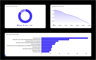
Here’s a screenshot of a simple data product I’ve built that displays three different charts for different reporting dimensions exposed by the Google Analytics API for page views for my site, paulie.dev, from the last seven days.
You can find all the code used in this article on the following link:
Getting Started With Luzmo
Before we get going, hop over to Luzmo and sign up for a free trial. You might also like to have a read of one of the getting started guides listed below. In this article, I’ll be using the Next.js starter.
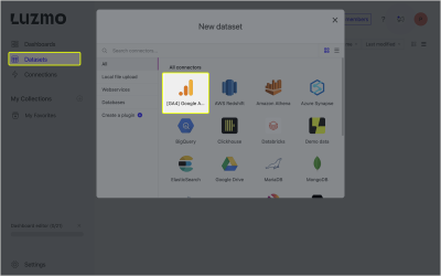
Creating a Google Analytics Dataset
To create data visualization, you’ll first need data! To achieve this using Luzmo, head over to the dashboard, select Datasets from the navigation, and select GA4 Google Analytics. Follow the steps shown in the UI to connect Luzmo with your Google Analytics account.
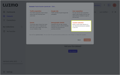
With the setup complete, you can now select which reporting dimensions to add to your dataset. To follow along with this article, select Custom selection.
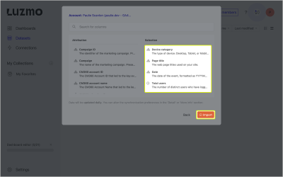
Lastly, select the following using the search input. Device Category, Page Title, Date, and Total users, then click Import when you’re ready.
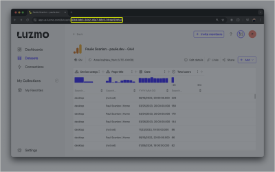
You now have all the data required to build the Google Analytics dashboard. You can access the dataset ID from the URL address bar in your browser. You’ll need this in a later step.
If you’ve followed along from either of the first two getting started guides, you’ll have your API Key, API Token, App server, and API host environment variables set up and saved in a .env file.
Install Dependencies
If you’ve cloned one of the starter repositories, run the following to install the required dependencies.
npm installNext, install the Luzmo React Embed dependency which exports the LuzmoVizItemComponent.
npm install @luzmo/react-embed@latestNow, find page.tsx located in the src/app directory, and add your dataset id as shown below.
Add the access object from the destructured response and pass access.datasets(0).id onto the LuzmoClientComponent component using a prop named datasetId.
// src/app/page.tsx+ import dynamic from \'next/dynamic\';import Luzmo from \'@luzmo/nodejs-sdk\';- import LuzmoClientComponent from \'./components/luzmo-client-component\';+ const LuzmoClientComponent = dynamic(() => import(\'./components/luzmo-client-component\'), { ssr: false,});const client = new Luzmo({ api_key: process.env.LUZMO_API_KEY!, api_token: process.env.LUZMO_API_TOKEN!, host: process.env.NEXT_PUBLIC_LUZMO_API_HOST!,});export default async function Home() { const response = await client.create(\'authorization\', { type: \'embed\', username: \'user id\', name: \'first name last name\', email: \'[email protected]\', access: { datasets: ( {-id: \'\',+id: \'42b43db3-24b2-45e7-98c5-3fcdef20b1a3\',rights: \'use\', }, ), }, });- const { id, token } = response;+ const { id, token, access } = response;- return And lastly, find luzmo-client-component.tsx located in src/app/components. This is where you’ll be creating your charts.
Building a Donut Chart
The first chart you’ll create is a Donut chart that shows the various devices used by visitors to your site.
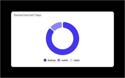
Add the following code to luzmo-client-component.tsx component.
// src/app/component/luzmo-client-component.tsx\'use client\';+ import { LuzmoVizItemComponent } from \'@luzmo/react-embed\';interface Props { authKey: string; authToken: string;+ datasetId: string;}- export default function LuzmoClientComponent({ authKey, authToken}: Props) {+ export default function LuzmoClientComponent({ authKey, authToken, datasetId }: Props) {+ const date = new Date(new Date().getTime() - 7 * 24 * 60 * 60 * 1000).toISOString(); // creates a date 7 days ago console.log({ authKey, authToken }); return ( منبع: https://smashingmagazine.com/2024/09/how-build-custom-data-visualizations-luzmo-flex/