<img> using clever CSS techniques that demonstrate advanced, modern styling practices.
In a previous article, we played with CSS masks to create cool hover effects where the main challenge was to rely only on the <img> tag as our markup. In this article, pick up where we left off by “revealing” the image from behind a sliding door sort of thing — like opening up a box and finding a photograph in it.
See the Pen (Image gift box (hover to reveal))(https://codepen.io/smashingmag/pen/LYaPPPo) by Temani Afif.
Pretty neat, right? You might think this is an easy thing to pull off. All we really need is an overlay above the image that we translate, and, boom, we’re done, right?
That’s true. But if you check the code, you won’t find any additional elements in the markup other than the exact same <img> tag we used last time. Plus, we cannot even use pseudo-elements to make this work. This is what makes such an effect a bit more challenging.
Don’t look at the code right now. Let’s build it together by breaking the demo into isolated little CSS tricks.
The Image And Sliding Overlay
You would be correct in thinking it’s impossible to add an overlay to an image without an extra element. Instead, we are going to fake it and create the illusion of an overlay.
Let’s start with the following code:
img {
  --s: 200px; /* the image size */

  width: var(--s);
  box-sizing: border-box;
  padding-right: var(--s);
  background: #8A9B0F;
  transition: 1s;
}
img:hover {
  padding: 0;
}
We have defined the width as a CSS variable (--s) and repurposed it to apply padding along the right side of the element. Combined with box-sizing: border-box, this will make the size of the content box equal to 0. In other words, we don’t see the image, but we see the background color since it covers the padding area.
On hover, let’s make the padding equal to 0:
See the Pen (Padding animation to reveal the image)(https://codepen.io/smashingmag/pen/jOJrqXo) by Temani Afif.
Nothing surprising, right? By decreasing the padding, we increase the size of the content box and it slowly reveals the image. We’re basically squishing it vertically and allowing to widen back into place on hover.
Let’s add two more properties to the mix:
img {
  object-fit: cover;
  object-position: left;
}
See the Pen (Adding object-* properties)(https://codepen.io/smashingmag/pen/oNVLLdM) by Temani Afif.
Tada! The effect looks much better now, and we have an overlay reveal animation even if, in reality, the overlay you see is the background, which is behind the image! The illusion is perfect.
Why does it behave like that? The logic is explained nicely over at MDN:
“The replaced content is sized to maintain its aspect ratio while filling the element’s entire content box. If the object’s aspect ratio does not match the aspect ratio of its box, then the object will be clipped to fit.”
In other words, the image will maintain its ratio while filling the content box. As a result, the image does not get distorted by the padding as we saw in the first demo — instead, it is clipped. Then, object-position: left aligns the position of the image to the left so it doesn’t move while the size of the content box increases as a result of the decreased padding on hover.
If we change the position to right, you get a different effect:
See the Pen (Using object-position: right)(https://codepen.io/smashingmag/pen/xxBOOJW) by Temani Afif.
Instead of an overlay animation, we have a kind of sliding effect where the image enters from the left. This is directly related to another cool CSS trick that I used in a previous article to create a “pop-out” hover effect:
See the Pen (Fancy Pop Out Reveal hover effect!)(https://codepen.io/smashingmag/pen/VwqWRyj) by Temani Afif.
For this article, we are going to rely on the first effect, where the image remains fixed. Here is a demo with all the sliding variations:
See the Pen (A reveal hover effect with one element)(https://codepen.io/smashingmag/pen/GRYEZrr) by Temani Afif.
You will notice that it’s pretty easy to switch between the different variations by toggling a couple of values in the CSS.
Sliding The Overlay Outside The Image
Now that we have our overlay, let’s try to slide it outside of the image. Instead of decreasing its size like we did previously, we want it to maintain its size and move it.
For this, let’s use a box-shadow animation:
img {
  --s: 200px; /* the image size */

  box-shadow: 0 0 #8A9B0F;
}
img:hover {
  box-shadow: var(--s) 0 #8A9B0F;
}
See the Pen (Adding box-shadow animation)(https://codepen.io/smashingmag/pen/KKEMvNq) by Temani Afif.
Cool, right? We have an overlay above our image that slides over to reveal the image — without using any extra elements in the markup or pseudo-elements in the styles!
We can do the same effect using a clip-path animation as well.
img {
  --s: 200px; /* the image size */

  box-shadow: 0 0 0 999px #8A9B0F;
  clip-path: inset(0 0 0 0);
}
img:hover {
  clip-path: inset(0 -100% 0 0);
}
We define a box-shadow as having a widespread radius, but we won’t actually see it because it’s clipped. On hover, though, we update the inset() value to reveal the box-shadow on the right side of the image.
See the Pen (Using clip-path instead of box-shadow)(https://codepen.io/smashingmag/pen/YzgWxxK) by Temani Afif.
Using the same technique, we can slide the overlay in whatever direction we want. Can you figure out how? Give it a shot by forking the Pen above and changing directions as an exercise before we move to the next part of our work.
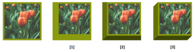
Adding Borders
Borders can help create space around the image and get it close to a square box shape. Don’t forget that we want to create a 3D box in the end. But let’s see what happens when we add borders.
See the Pen (Adding border)(https://codepen.io/smashingmag/pen/YzgWrvQ) by Temani Afif.
Hmm, not good. The border sits above the overlay, and the image isn’t a perfect square, at least initially. Even if that seems glitchy at first, it’s a logical outcome since the border is painted above the background, and its thickness adds up to the element’s total size.
What we need to do is adjust the padding to account for the border’s size. Then, let’s make the border transparent so that we can see the background color behind it.
img {
  --s: 200px; /* the image size */
  --b: 10px;  /* border width */
  --c: #8A9B0F;

  width: var(--s);
  aspect-ratio: 1;
  box-sizing: border-box;
  padding-top: calc(var(--s) - 2*var(--b));
  border: var(--b) solid #0000;
  box-shadow: 0 0 0 999px var(--c);
  background: var(--c);
  clip-path: inset(0);
  object-fit: cover;
  object-position: bottom;
}
img:hover {
  padding: 0;
  clip-path: inset(-100% 0 0);
}
See the Pen (Fixing the border issue)(https://codepen.io/smashingmag/pen/mdoEBQX) by Temani Afif.
This looks a lot better. It would be even better if we were to use a different color for the border area. Let’s consider using multiple backgrounds.
img {
  --c: #8A9B0F;
  --_c: color-mix(in srgb, var(--c), #fff 25%);

  background:
    linear-gradient(var(--_c) 0 0) no-repeat
     0 0 / 100% 100%,
    var(--c);
  background-origin: border-box;
  box-shadow: 0 0 0 999px var(--_c);
  /* same as previous */
}
img:hover {
  background-size: 100% 0%;
  /* same as previous */
}
First off, note that we’ve added the color-mix() function that allows us to define a new color variation from the original color value (--c: #8A9B0F) by mixing it with white to get a brighter shade. Then, we use that new color to create a gradient above the element’s background color, which is declared right after the gradient. The same color is also used for the box-shadow.
The idea is to decrease the size of the gradient the same way we do with the padding so that the background-color behind the gradient is revealed.
See the Pen (Adding gradient animation)(https://codepen.io/smashingmag/pen/rNRLJpB) by Temani Afif.
That’s really nice! But did you catch the subtle visual issue? If you look closely, you can notice that the overlay is slightly out of alignment with the border.
This is because the padding has a transition that goes from s - 2*b to 0. Meanwhile, the background transitions from 100% (equivalent to --s) to 0. There’s a difference equal to 2*b. The background covers the entire area, while the padding covers less of it. We need to account for this.
Ideally, the padding transition would take less time to complete and have a small delay at the beginning to sync things up, but finding the correct timing won’t be an easy task. Instead, let’s increase the padding transition’s range to make it equal to the background.
img {
  --h: calc(var(--s) - var(--b));
  padding-top: min(var(--h), var(--s) - 2*var(--b));
  transition: --h 1s linear;
}
img:hover {
  --h: calc(-1 * var(--b));
}
The new variable, --h, transitions from s - b to -b on hover, so we have the needed range since the difference is equal to --s, making it equal to the background and clip-path transitions.
The trick is the min() function. When --h transitions from s - b to s - 2*b, the padding is equal to s - 2*b. No padding changes during that brief transition. Then, when --h reaches 0 and transitions from 0 to -b, the padding remains equal to 0 since, by default, it cannot be a negative value.
It would be more intuitive to use clamp() instead:
padding-top: clamp(0px, var(--h), var(--s) - 2*var(--b));
That said, we don’t need to specify the lower parameter since padding cannot be negative and will, by default, be clamped to 0 if you give it a negative value.
We are getting much closer to the final result!
See the Pen (Fixing the padding issue)(https://codepen.io/smashingmag/pen/ExMgZbW) by Temani Afif.
Worth noting that we need to use @property to be able to apply a transition to the --h variable. The transition won’t work in Firefox at the time of this writing.
The 3D Effect
The last step is to add a touch of 3D to the effect. To better understand how we’re going to approach this, let’s temporarily remove the box-shadow, clip-path, and the linear-gradient() with the image in its revealed state.
See the Pen (The revealed image with border)(https://codepen.io/smashingmag/pen/QWoKpyE) by Temani Afif.
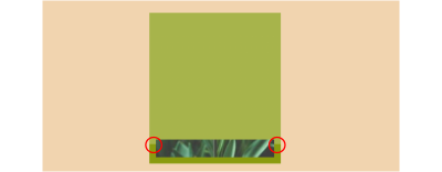
We’ll take three steps to create the 3D effect I have mapped out in the following figure.
First, we increase the border’s thickness on the left and bottom sides of the image:
img {
  --b: 10px; /* the image border */
  --d: 30px; /* the depth */

  border: solid #0000;
  border-width: var(--b) var(--b) calc(var(--b) + var(--d)) calc(var(--b) + var(--d));
}
Second, we add a conic-gradient() on the background to create darker colors around the box:
background:
  conic-gradient(at left var(--d) bottom var(--d),
   #0000 25%,#0008 0 62.5%,#0004 0)
  var(--c);
Notice the semi-transparent black color values (e.g., #0008 and #0004). The slight bit of transparency blends with the colors behind it to create the illusion of a dark variation of the main color since the gradient is placed above the background color.
And lastly, we apply a clip-path to cut out the corners that establish the 3D box.
clip-path: polygon(var(--d) 0, 100% 0, 100% calc(100% - var(--d)), calc(100% - var(--d)) 100%, 0 100%, 0 var(--d));
See the Pen (The image within a 3D box)(https://codepen.io/smashingmag/pen/JjzRWXZ) by Temani Afif.
Now that we see and understand how the 3D effect is built let’s put back the things we removed earlier, starting with the padding:
See the Pen (Putting back the padding animation)(https://codepen.io/smashingmag/pen/ExMgWXR) by Temani Afif.
It works fine. But note how we’ve introduced the depth (--d) to the formula. That’s because the bottom border is no longer equal to b but b + d.
--h: calc(var(--s) - var(--b) - var(--d));
padding-top: min(var(--h),var(--s) - 2*var(--b) - var(--d));
Let’s do the same thing with the linear gradient. We need to decrease its size so it covers the same area as it did before we introduced the depth so that it doesn’t overlap with the conic gradient:
See the Pen (Putting back the gradient animation)(https://codepen.io/smashingmag/pen/VwRKpzN) by Temani Afif.
We are getting closer! The last piece we need to add back in from earlier is the clip-path transition that is combined with the box-shadow. We cannot reuse the same code we used before since we changed the clip-path value to create the 3D box shape. But we can still transition it to get the sliding result we want.
The idea is to have two points at the top that move up and down to reveal and hide the box-shadow while the other points remain fixed. Here is a small video to illustrate the movement of the points.
See that? We have five fixed points. The two at the top move to increase the area of the polygon and reveal the box shadow.
img {
  clip-path: polygon(
    var(--d) 0, /* --> var(--d) calc(-1*(var(--s) - var(--d))) */
    100%     0, /* --> 100%     calc(-1*(var(--s) - var(--d))) */

    /* the fixed points */
    100% calc(100% - var(--d)), /* 1 */
    calc(100% - var(--d)) 100%, /* 2 */
    0 100%,                     /* 3 */
    0 var(--d),                 /* 4 */
    var(--d) 0);                /* 5 */
}
And we’re done! We’re left with a nice 3D frame around the image element with a cover that slides up and down on hover. And we did it with zero extra markup or reaching for pseudo-elements!
See the Pen (3D image with reveal effect)(https://codepen.io/smashingmag/pen/GRejXMK) by Temani Afif.
And here is the first demo I shared at the start of this article, showing the two sliding variations.
See the Pen (Image gift box (hover to reveal))(https://codepen.io/smashingmag/pen/LYaPPPo) by Temani Afif.
This last demo is an optimized version of what we did together. I have written most of the formulas using the variable --h so that I only update one value on hover. It also includes another variation. Can you reverse-engineer it and see how its code differs from the one we did together?
One More 3D Example
Want another fancy effect that uses 3D effects and sliding overlays? Here’s one I put together using a different 3D perspective where the overlay splits open rather than sliding from one side to the other.
See the Pen (Image gift box II (hover to reveal))(https://codepen.io/smashingmag/pen/yLwBVGQ) by Temani Afif.
Your homework is to dissect the code. It may look complex, but if you trace the steps we completed for the original demo, I think you’ll find that it’s not a terribly different approach. The sliding effect still combines the padding, the object-* properties, and clip-path but with different values to produce this new effect.
Conclusion
I hope you enjoyed this little 3D image experiment and the fancy effect we applied to it. I know that adding an extra element (i.e., a parent <div> as a wrapper) to the markup would have made the effect a lot easier to achieve, as would pseudo-elements and translations. But we are here for the challenge and learning opportunity, right?
Limiting the HTML to only a single element allows us to push the limits of CSS to discover new techniques that can save us time and bytes, especially in those situations where you might not have direct access to modify HTML, like when you’re working in a CMS template. Don’t look at this as an over-complicated exercise. It’s an exercise that challenges us to leverage the power and flexibility of CSS.
(gg, yk)
]
منبع: https://smashingmagazine.com/2024/04/sliding-3d-image-frames-css/