
Remember the “mobile first” mantra? The idea was born out of the early days of responsive web design. Rather than design and build for the “desktop” up front, a “mobile-first” approach treats small screens as first-class citizens. There’s a reduced amount of real estate, certainly less than the number of pixels we get from the viewport of Firefox expanded fullscreen on a 27-inch studio monitor.
The constraint is a challenge to make sure that whatever is sent to mobile devices is directly relevant to what users should need; nothing more, nothing less. Anything more additive to the UI can be reserved for wider screens where we’re allowed to stretch out and make more liberal use of space.
/* A sample CSS snippet for a responsive main content */

/* Base Styles */
.main-content {
  container: main / inline-size;
}

.gallery {
  display: grid;
  gap: 1rem;
}

/* Container is wider than or equal to 700px */
@container main (width >= 700px) {
  .gallery {
    grid-template-columns: 1fr 1fr;
  }
}

/* Container is wider than or equal to 1200px */
@container main (width >= 1200px) {
  .gallery {
    grid-template-columns: repeat(4, 1fr);
  }
}
Now, I’m not here to admonish anyone who isn’t using a mobile-first approach when designing and building web interfaces. If anything, the last five or so years have shown us just how unpredictable of a medium the web is, including what sort of device is displaying our work all the way down to a user’s individual preferences.
Even so, there are things that any designer and developer should consider when working with mobile interfaces. Now that we’re nearly 15 years into responsive web design as a practice and craft, users are beginning to form opinions about what to expect when trying to do certain things in a mobile interface. I know that I have expectations. I am sure you have them as well.
I’ve been keeping track of the mobile interfaces I use and have started finding common patterns that feel mobile in nature but are more desktop-focused in practice. While keeping track of the mobile interfaces I use, I’ve found common patterns that are unsuitable for small screens and thus could use some updates. Here are some reworked features that are worth considering for mobile interfaces.
Economically-Sized Forms
There are myriad problems that come up while completing mobile forms — e.g., small tap targets, lack of offline support, and incorrect virtual keyboards, to name a few — but it’s how a mobile form interacts with the device’s virtual keyboard that draws my ire the most.
The keyboard obscures the form more times than not. You tap a form field, and the keyboard slides up, and — poof! — it’s as though half the form is chopped out of view. If you’re thinking, Meh, all that means is a little extra scrolling, consider that scrolling isn’t always a choice. If the page is a short one with only the form on it, it’s highly possible what you see on the screen is what you get.
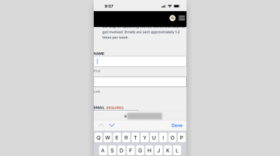
A more delightful user experience for mobile forms is to take a “less is more” approach. Display one form field at a time for an economical layout that allows the field and virtual keyboard to co-exist in harmony without any visual obstructions. Focusing the design on the top half of the viewport with room for navigation controls and microcopy creates a seamless flow from one form input to the next.

More Room For Searching
Search presents a dichotomy: It is incredibly useful, yet is treated as an afterthought, likely tucked in the upper-right corner of a global header, out of view and often further buried by hiding the form input until the user clicks some icon, typically a magnifying glass. (It’s ironic we minimize the UI with a magnifying glass, isn’t it?)

The problem with burying search in a mobile context is two-fold:
- The feature is less apparent, and
- The space to enter a search query, add any filters, and display results is minimized.
That may very well be acceptable if the site has only a handful of pages to navigate. However, if the search allows a user to surface relevant content and freely move about an app, then you’re going to want to give it higher prominence.

Some sites even have search forms that occupy the full screen without surrounding components, offering a “distraction-free” interface for typing queries.

No Drop-Downs, If Possible
The <select> element can negatively impact mobile UX in two glaring ways:
- An expanding
<select>with so many options that it produces excessive scrolling. - Scrolling excessively, particularly on long pages, produces an awkward situation where the page continues scrolling after already scrolling through the list of
<option>s.
I’ll come across these situations, stare at my phone, and ask:
Do I really need a
<select>populated with one hundred years to submit my birthdate?
Seems like an awful lot of trouble to sort through one hundred years compared to manually typing in a four-digit value myself.
<select> menu that contains a large list of options can lead to awkward scrolling situations. (Large preview)A better pattern for making list selections, if absolutely needed, in a space-constrained mobile layout could be something closer to the ones used by iOS and Android devices by default. Sure, there’s scrolling involved, but within a confined space that leaves the rest of the UI alone.

A Restrained Overview
A dashboard overview in a mobile app is something that displays key data to users right off the bat, surfacing common information that the user would otherwise have to seek out. There are great use cases for dashboards, many of which you likely interact with daily, like your banking app, a project management system, or even a page showing today’s baseball scores. The WordPress dashboard is a perfect example, showing site activity, security checks, traffic, and more.
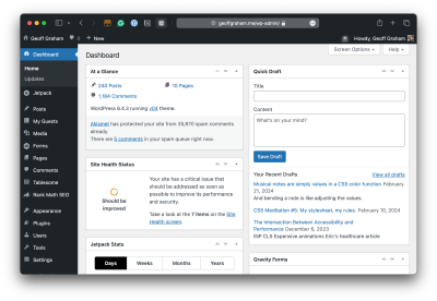
Dashboards are just fine. But the sensitive information they might contain is what worries me when I’m viewing a dashboard on a mobile device.
Let’s say I’m having dinner with friends at a restaurant. We split the check. To pay my fair share, I take out my phone and log into my banking app, and… the home screen displays my bank balance in big, bold numbers to the friends sitting right next to me, one of whom is the gossipiest of the bunch. There goes a bit of my pride.
That’s an extreme illustration because not all apps convey that level of sensitive information. But many do, and the care we put into protecting a user’s information from peeping eyeballs is only becoming more important as entire industries, like health care and education, lean more heavily into online experiences.
My advice: Hide sensitive information until prompted by the user to display it.

Shortcuts Provided In The Login Flow
There’s a natural order to things, particularly when logging into a web app. We log in, see a welcome message, and are taken to a dashboard before we tap on some item that triggers some sort of action to perform. In other words, it takes a few steps and walking through a couple of doors to get to accomplish what we came to do.
What if we put actions earlier in the login flow? As in, they are displayed right along with the login form. This is what we call a shortcut.
Let’s take the same restaurant example from earlier, where I’m back at dinner and ready to pay. This time, however, I will open a different bank app. This one has shortcuts next to the login form, one of which is a “Scan to Pay” option. I tap it, log in, and am taken straight to the scanning feature that opens the camera on my device, completely bypassing any superfluous welcome messaging or dashboard. This spares the user both time and effort (and prevents sensitive information from leaking into view to boot).

Mobile operating systems also provide options for shortcuts when long-pressing an app’s icon on the home screen, which also can be used to an app’s advantage.
The Right Keyboard Configuration
All modern mobile operating systems are smart enough to tailor the virtual keyboard for specialized form inputs. A form field markup with type="email", for instance, triggers an onscreen keyboard that shows the “@” key in the primary view, preventing users from having to tap Shift to reveal it in a subsequent view. The same is true with URLs, where a “.com” key surfaces for inputs with type="url".

@ key shown upfront. (Large preview)The right keyboard saves the effort of hunting down relevant special characters and numbers for specific fields. All we need to do is to use the right attributes and semantics for those fields, like, type=email, type=url, type=tel, and such.
<!-- Input Types for Virtual Keyboards -->
<input type="text">   <!-- default -->
<input type="tel">    <!-- numeric keyboard -->
<input type="number"> <!-- numeric keyboard -->
<input type="email">  <!-- displays @ key -->
<input type="url">    <!-- displays .com key -->
<input type="search"> <!-- displays search button -->
<input type="date">   <!-- displays date picker or wheel controls -->
Bigger Fonts With Higher Contrast
This may have been one of the first things that came to your mind when reading the article title. That’s because small text is prevalent in mobile interfaces. It’s not wrong to scale text in response to smaller screens, but where you set the lower end of the range may be too small for many users, even those with great vision.
The default size of body text is 16px on the web. That’s thanks to user agent styling that’s consistent across all browsers, including those on mobile platforms. But what exactly is the ideal size for mobile? The answer is not entirely clear. For example, Apple’s Human Interface Guidelines do not specify exact font sizes but rather focus on the use of Dynamic Text that adjusts the size of content to the user’s device-level preferences. Google’s Material Design guidelines are more concrete but are based on three scales: small, medium, and large. The following table shows the minimum font sizes for each scale based on the system’s typography tokens.
| Scale | Body Text (pt) | Body Text (px) |
|---|---|---|
| Small | 12pt |
16px |
| Medium | 14pt |
18.66px |
| Large | 16pt |
21.33px |
The real standard we ought to be looking at is the current WCAG 2.2, and here’s what it says on the topic:
“When using text without specifying the font size, the smallest font size used on major browsers for unspecified text would be a reasonable size to assume for the font.”
So, bottom line is that the bottom end of a font’s scale matches the web’s default 16px if we accept Android’s “Small” defaults. But even then, there are caveats because WCAG is more focused on contrast than size. Like, if the font in use is thin by default, WCAG suggests bumping up the font size to produce a higher contrast ratio between the text and the background it sits against.
There are many, many articles that can give you summaries of various typographical guidelines and how to adhere to them for optimal font sizing. The best advice I’ve seen, however, is Eric Bailey rallying us to “beat the “Reader Mode” button. Eric is talking more specifically about preventing clutter in an interface, but the same holds for font sizing. If the text is tiny or thin, I’m going to bash that button on your site with no hesitation.

Wrapping Up
Everything we’ve covered here in this article is personal irritations I feel when interacting with different mobile interfaces. I’m sure you have your own set of annoyances, and if you do, I’d love to read them in the comments if you’re willing to share. And someone else is likely to have even more examples.
The point is that we’re in some kind of “post-responsive” era of web design, one that looks beyond how elements stack in response to the viewport to consider user preferences, privacy, and providing optimal experiences at any breakpoint regardless of whatever device is used.
(gg, yk)
]
منبع: https://smashingmagazine.com/2024/04/things-users-would-appreciate-mobile-apps/